Allconnect
Finding the “right” methodology to drive positive design change
Visit AllconnectCreate a simple marketplace experience for comparing internet plans and providers
User testing recruitment, facilitation and analysis, create and prototype wireframes
+40% conversion rate
+79% profit/session
+$22k in monthly profit
A question I get often from non-researchers is how I determine which research methodology to use in a given project.
While there are several factors to consider, my philosophy is that there are no wrong ways to approach research; it’s all a matter of efficiency.
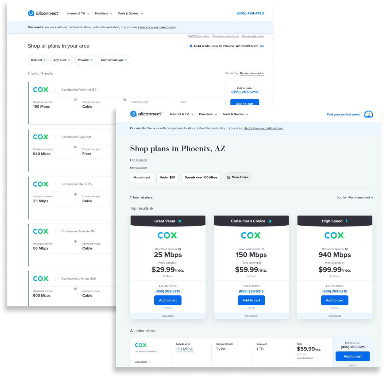
Allconnect.com was looking to completely redesign their product comparison page to improve sales. This project had been going on for over a week, going in circles around what design direction would be most effective.
Seeing there was no end in sight, the business stakeholder suggested A/B testing both design concepts on the live site, their usual go-to method. While this methodology could have gotten us to the answer we were looking for, I determined that it was highly inefficient for two reasons. Firstly, we would have to spend both design and development resources building out two completely different designs to test this hypothesis, which would take several weeks. Secondly, once the A/B testing was completed and a “winner” is determined, all that time spent on the “losing” design would be seen as wasted effort, which would lower morale for the people who worked on it.

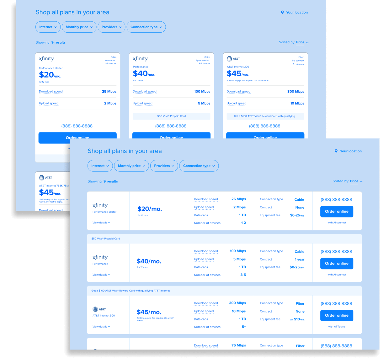
Therefore, I proposed and executed a more efficient option: comparative preference testing of low-fidelity wireframes, where a user would view each design concept in random order and give feedback on which was easiest to use. This methodology allowed us to spend minimal design resources spinning up wireframes for each design concept, and then narrow down our options to one final mockup that we felt confident enough to invest development resources on.
We ended up testing four concepts, which allowed us to test multiple variables and hypotheses in one research project. Through preference testing, we were able to refine our ideas into one option, which we fully built and live A/B tested against our current product comparison page as the control. As a result, the new design won out with a 40% increase in sales and a 79% increase in profit per user session.
