Lonely Planet
Simplifying traveler decisions for where to go next

Lonely Planet
Simplifying traveler decisions for where to go next
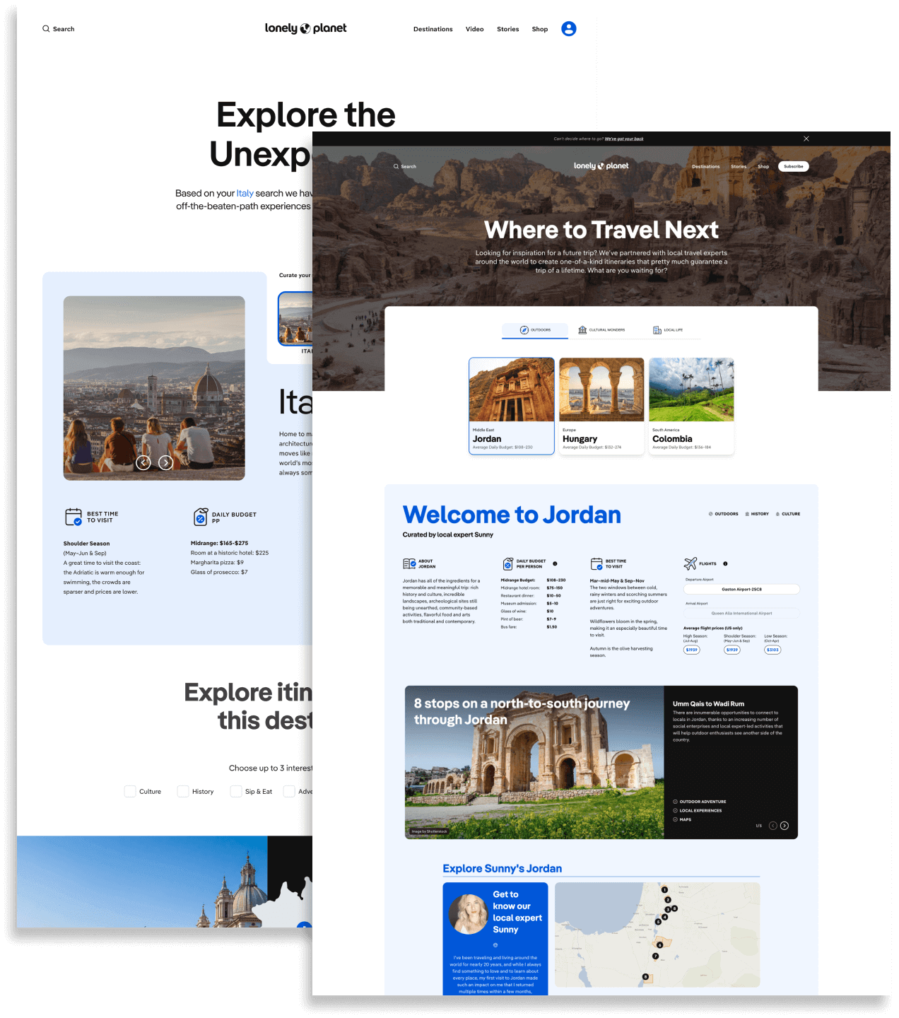
Develop a new product that provides curated destination recommendations to help travelers find their next adventure
Workshop co-facilitation, user testing recruitment, facilitation and analysis, research SME
+85% email signups
+53% average time on site
As part of an initiative to expand Lonely Planet’s digital product offerings, I participated in a “tiger team” to complete a multi-week design sprint led by external consultants from IDEO.
Through close collaboration with the consultants and my team members, I injected user perspectives while streamlining my research process to fit within a constrained timeline without sacrificing quality.
The biggest constraint for this project was the tight turnaround for delivering research on top of my additional sprint responsibilities as co-facilitator. In response, I did as much planning and setup as I could ahead of time so the 3-week design sprint cycle could continue without a hitch.
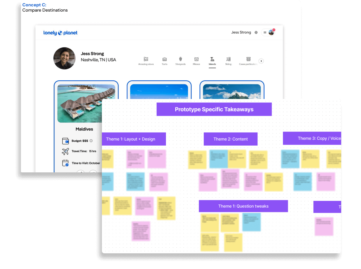
I created script and note-taking templates that I could re-use every week. I recruited participants a week ahead to ensure availability and queued up their compensation to be delivered shortly after their sessions automatically. Analysis was done via affinity mapping as a group, so I created space in our interactive whiteboards ahead of time to guide group discussions and encourage participation.
These steps allowed me to stay ahead as I participated in other sprint activities during the rest of the week.

Every week, I delivered insights and guided the rest of the “tiger team” through group activities to digest the research. These insights led us to selecting a winning idea and dedicate 10 additional weeks to refine, build and launch it. Just as I did for the earlier sprints, I organized agile usability testing processes to give us quick, quality insights that guided the final product.
We saw the fruits of our efforts after launch, with our new digital experience gaining an 85% increase in email subscriptions and 53% increase in time spent on site compared to the rest of the website.
