Lonely Planet Web Redesign
Using keen observation skills and strong storytelling techniques to identify opportunities and present recommendations for a website redesign project.
Timeline
3 weeks
Methods
Ethnographic interview, contextual inquiry
Context
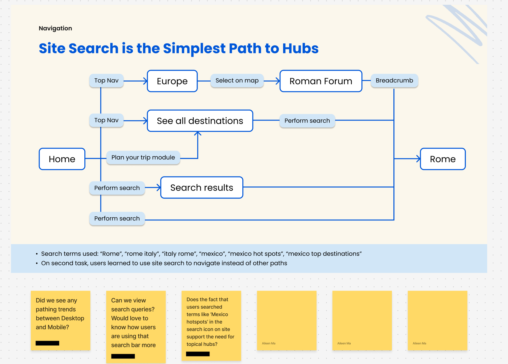
Lonely Planet is well-known for their travel guides, but the website experience was greatly underappreciated and in need of a redesign, starting with their bread-and-butter destination pages. These pages served as “hubs” of information, serving as a summarized view of a country or city and all it had to offer.
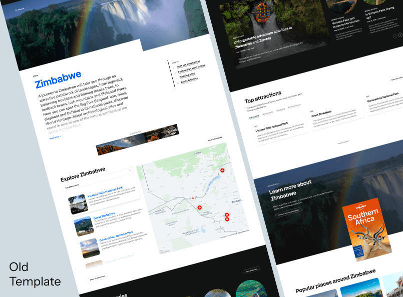
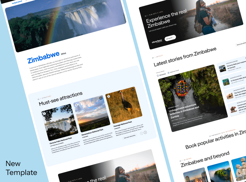
While the product and design teams already had ideas brewing for the future of these “Hub” pages, they needed me, their sole UX researcher, to gather data that shed light on how the current page templates were used by visitors and provide strategic direction for the “Hub” template redesign project as a whole.
My findings from this research project was incredibly relevant to the strategic shift of the entire organization, directly influencing the direction of digital product, design and content projects moving forward.
Methodology
Based on my planning discussions with business and design stakeholders, the key research question I identified for this project was “How do people currently use lonelyplanet.com to plan trip itineraries, and in what ways does the current page template fall short?”
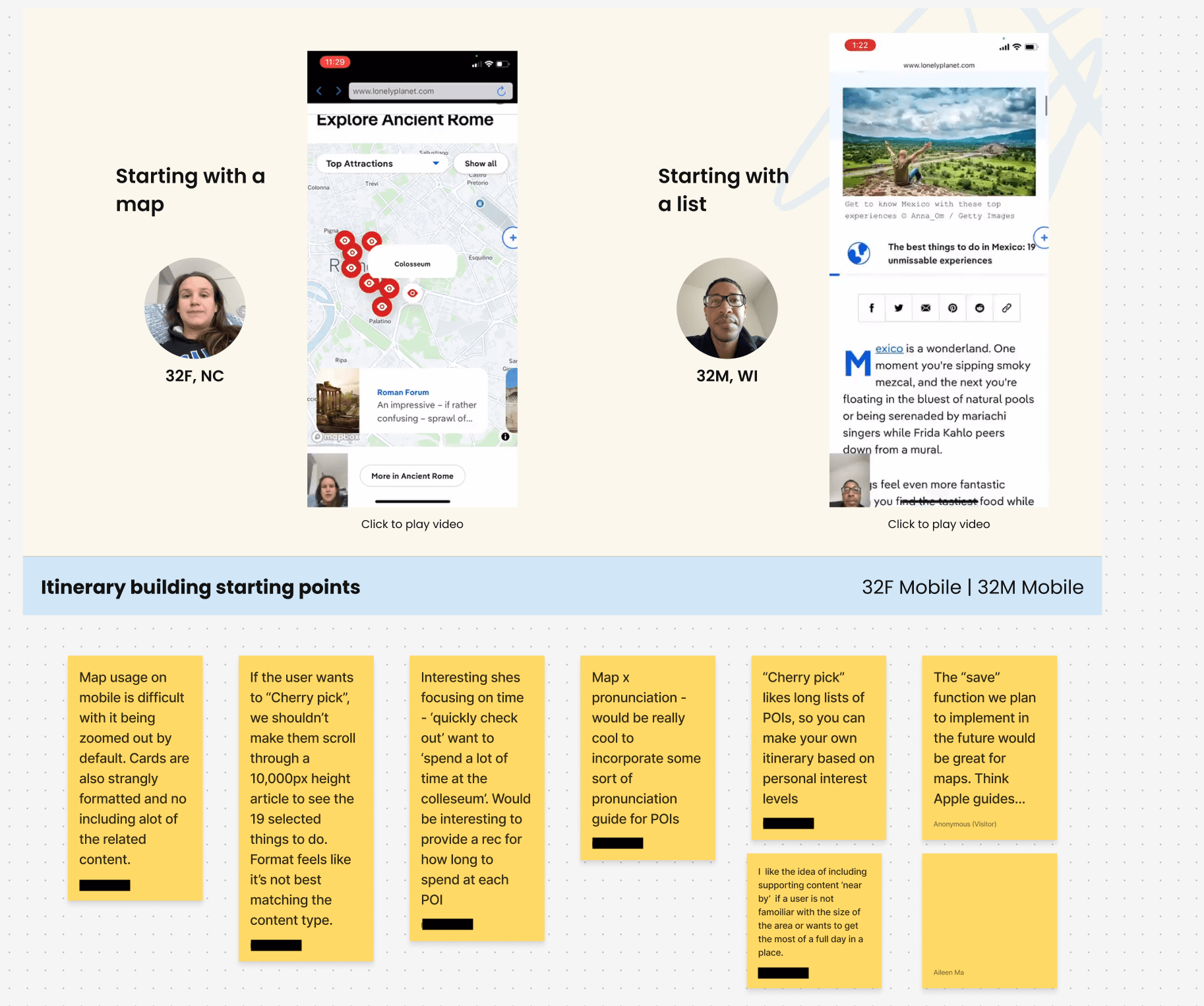
I sourced 9 travel-focused participants through UserTesting’s recruitment pool, using my screening questions to identify people that matched our key persona, the Engaged Traveler. I asked participants to use lonelyplanet.com on their desktop or mobile phone to perform two tasks: 1) plan a two-day trip to Rome and 2) find travel inspiration for what to do in Mexico.
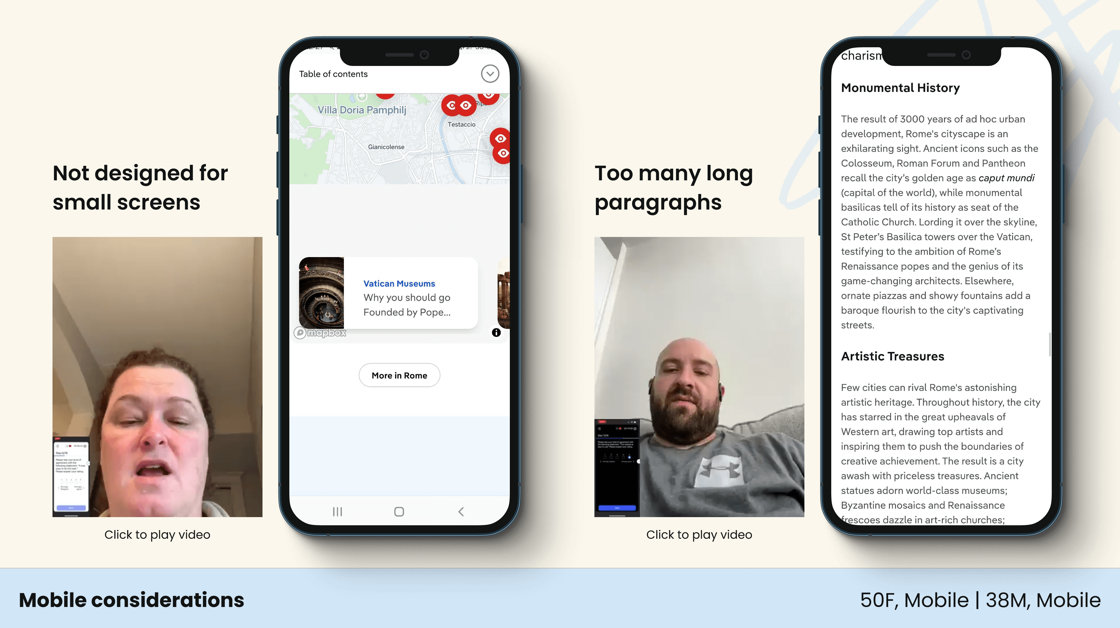
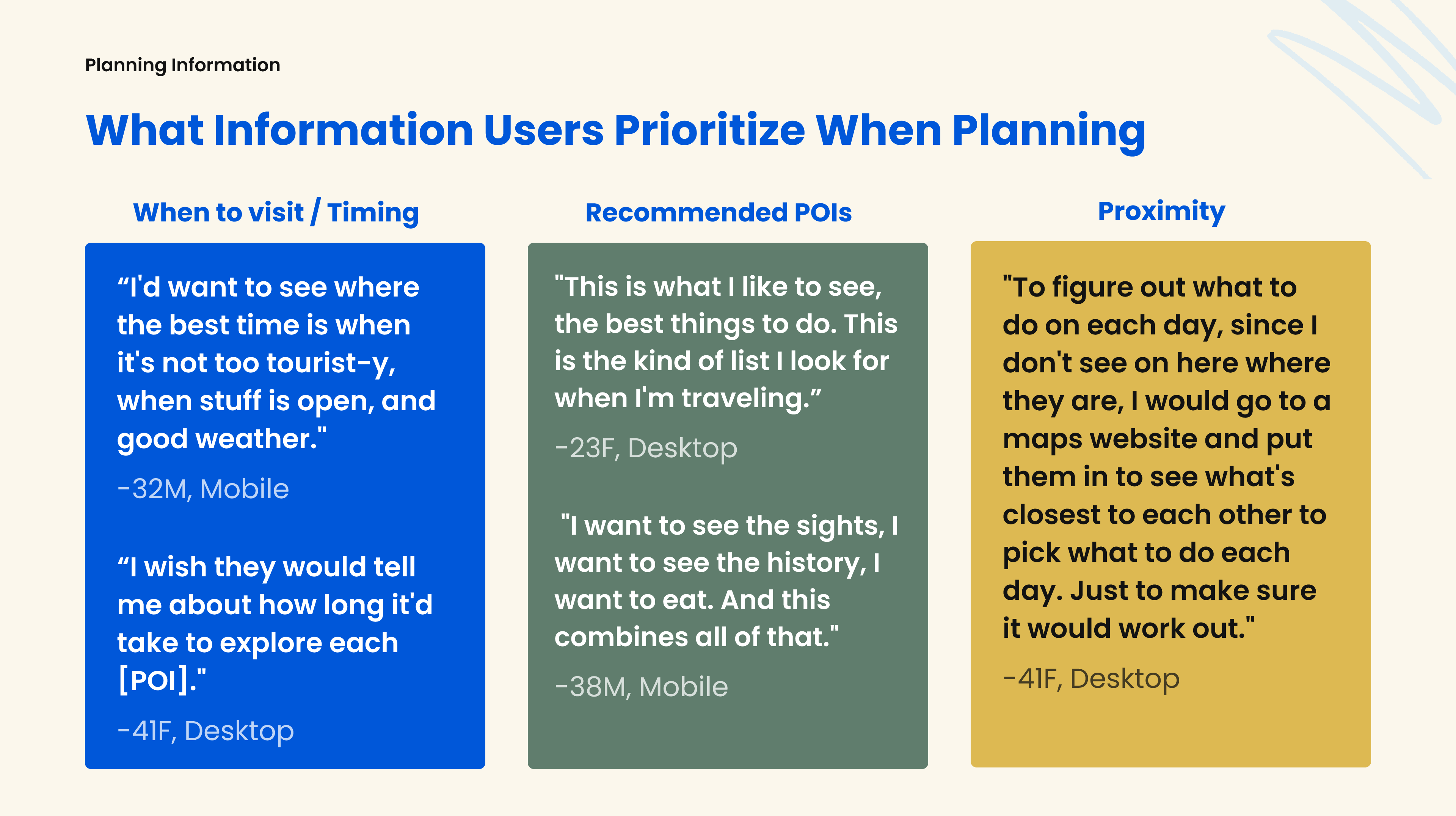
By carefully observing participants complete the tasks and asking the right follow-up questions, I was able to identify key areas of opportunity for the new Hub page templates, particularly around unmet information needs and a lackluster mobile experience.
Presentation
Once all the findings were synthesized, it was time for the big presentation to not only product and design stakeholders, but to several other leads of their departments, such as content strategy, customer success, and even senior leadership. The presentation needed to be data-driven, relevant, and, most importantly, engaging or I would lose my audience to multi-tasking.
For starters, I incorporated as many user quotes and session recordings as I could to support the points I was making with real qualitative data and break-up the monotony of hearing one speaker presenting. To encourage engagement, I created a mirror of my presentation on a Figma whiteboard and invited my audience to not only converse in the Zoom chat, but to contribute their thoughts about the topic directly on the slides. By incorporating these opportunities for collaboration, I gave department leaders a safe space to build upon each others’ ideas and see in real time which parts of my presentation spoke to them.
I have so many notes - this is great Aileen!
Sr Product Owner
This research is really helpful to our current planning conversations we are having.
Business Ops Manager
It was clear from the chatter in the chat log and from conversations afterwards that meeting attendees walked away from my presentation feeling energized and excited to work on the next phase for Lonely Planet’s online experience.